Maximize Donations: Optimizing WordPress for Nonprofits
Every nonprofit website needs to turn visitors into donors, but getting this right is a delicate science. With the right optimization strategies, you can transform your nonprofit’s WordPress site from a basic information hub into a powerful donation-generating machine.
Understanding the Donation Conversion Landscape
The numbers tell a compelling story. Over 60% of all donations now happen online, making your website your most critical fundraising tool. Yet most nonprofits leave money on the table with poorly optimized sites. Research shows well-designed donation pages can achieve conversion rates between 15-25% significantly higher than typical e-commerce sites that convert at less than 5%.

What’s particularly interesting is how donation behaviour varies across devices. Desktop users make the largest average donations at $118, followed by tablet users ($96) and mobile users ($79). However, with over 50% of nonprofit website traffic now coming from mobile devices, optimizing for all platforms is essential.
Performance matters tremendously. Studies show that 53% of visitors will abandon a website that takes longer than three seconds to load. This means your beautifully designed donation page becomes completely useless if it loads too slowly.
Strategic Placement and Design of CTAs
Your calls to action (CTAs) are the bridges between interest and action. Their placement, wording, and design can dramatically impact conversion rates.
Placement That Drives Action
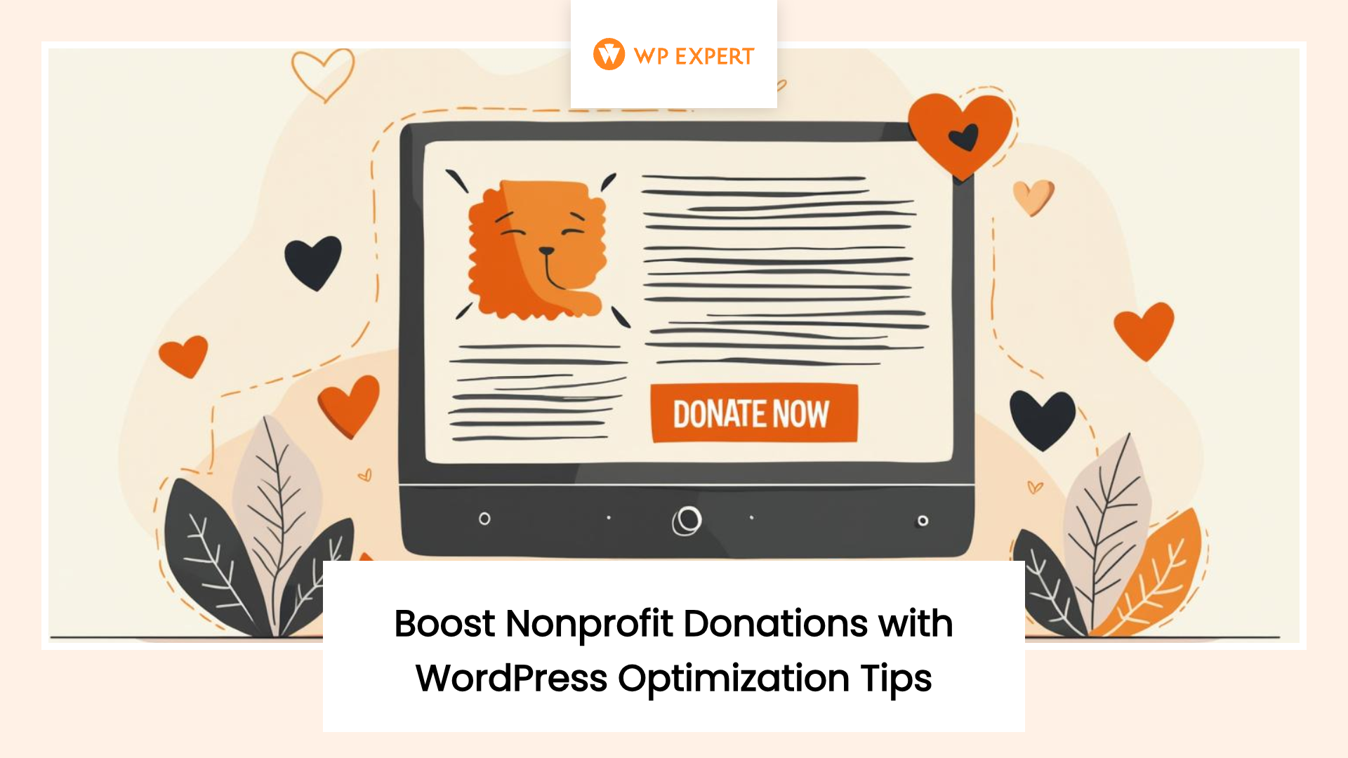
The most effective donation pages feature CTAs in multiple strategic locations. Always include a prominent “Donate Now” button in your main navigation where it remains visible throughout the entire site visit. This provides a constant opportunity for conversion regardless of where visitors explore.
Research shows that donation CTAs placed above the fold (visible without scrolling) typically convert 25-35% better than those requiring scroll. For longer pages, consider floating or sticky donation buttons that remain visible as users scroll through compelling content.
Don’t limit donation opportunities to a single page. Integrate contextual CTAs throughout your impact stories, program descriptions, and news updates. When visitors feel emotionally connected to a specific story, they’re primed to take immediate action.
Wording That Motivates
The language you use in your CTAs significantly impacts conversion rates. Generic phrases like “Donate” or “Give Now” perform adequately, but more specific, action-oriented language often drives better results.
Test phrases that create urgency or emphasize impact, such as “Help Today,” “Change Lives Now,” or “Make a Difference.” Adding personalization with first-person language can increase conversion rates by up to 42% in some cases “Join Me in Supporting” or “I Want to Help” creates psychological ownership of the action.
For maximum effectiveness, pair your CTA with a brief impact statement that answers the question “what will my donation accomplish?” For example, “Provide Clean Water – $25 Serves a Family for a Month” connects the donation directly to tangible outcomes.
Design Elements That Capture Attention
Your donation buttons should stand out visually from the rest of your content. Use contrasting colors that align with your brand but create visual priority. Button size matters too: buttons that are too small create friction, especially on mobile devices where touch accuracy is critical.
A/B testing reveals that rectangular buttons with slightly rounded corners typically outperform both sharp-cornered rectangles and circular buttons. The ideal button size is large enough to be easily tapped on mobile (at least 44×44 pixels) without dominating the screen.
Add subtle animation effects like gentle pulsing or soft shadows to draw attention without being distracting. These visual cues can increase click-through rates by highlighting the path to donation without disrupting the overall user experience.
Optimizing Donation Forms for Maximum Conversions
Your donation form is where good intentions either convert into actual support or abandon the process. Optimizing this critical component can dramatically improve your conversion rates.
Streamlining the Form Experience
Form length directly impacts completion rates. Every field you add to your donation form creates additional friction that can lead to abandonment. Research shows that reducing form fields from 11 to 4 can increase conversion rates by up to 120%.
Focus on collecting only essential information during the initial donation. This typically includes name, email, donation amount, and payment details. Additional information like addresses, phone numbers, or demographic data can be collected after the donation is complete or through follow-up communications.
Multi-step donation forms often outperform single-page forms, particularly for mobile users. Breaking the process into clearly defined steps (e.g., amount selection, personal information, payment details) makes the form feel less overwhelming. Studies show multi-step forms can increase conversion rates by up to 300% when implemented correctly.
Progress indicators are essential for multi-step forms, showing donors exactly where they are in the process and how many steps remain. This transparency reduces anxiety and prevents abandonment due to uncertainty about the time commitment required.
Strategic Donation Amount Options
How you present donation amounts significantly impacts both conversion rates and average donation size. Pre-selected donation amounts provide guidance to donors who may be uncertain about appropriate giving levels.
The psychology of suggested amounts is fascinating. Research shows that starting with higher amounts and moving to lower options (known as descending anchor points) tends to result in larger average donations compared to ascending options. For example, presenting options as $100, $50, $25 typically generates higher average gifts than listing $25, $50, $100.
Always include an “Other” option that allows donors to enter a custom amount. This prevents potential donors from abandoning the process if they don’t see an amount that matches their giving capacity or intention.
Connecting donation amounts to specific impacts creates powerful motivation. Instead of abstract numbers, show what each giving level accomplishes: “$30 provides a week of meals” or “$100 funds a month of education.” This tangible connection to outcomes increases both conversion rates and average donation sizes.
Reducing Friction in the Payment Process
Payment friction is one of the leading causes of donation abandonment. Offering multiple payment options is essential like credit/debit cards, PayPal, Apple Pay, Google Pay, and increasingly, cryptocurrency options. Each additional payment method can increase your potential donor pool.
The GiveWP plugin has emerged as a leader in the WordPress donation space, powering over 100,000 fundraisers with features like visual form builders, recurring donation support, and multiple payment gateway integrations. For smaller organizations, Charitable provides an excellent alternative with no transaction fees.
Security indicators and trust symbols play a crucial role in the payment process. Clearly display SSL certificates, payment processor logos, and security badges near your payment fields. These visual trust indicators can increase conversion rates by up to 42% by alleviating donor concerns about data security.
Simplify the credit card entry process by using auto-formatting that adds spaces and separates input fields for card numbers, expiration dates, and security codes. This reduces error rates and makes the form feel more responsive and user-friendly.

Enhancing User Journey with Mobile Optimization
Mobile optimization is no longer optional for nonprofits. With over 60% of nonprofit website visitors accessing sites via mobile devices, a seamless mobile experience is essential for maximizing donations.
Responsive Design Essentials
True responsive design goes beyond simply making your website fit different screen sizes. It requires rethinking the entire user experience for touch interfaces and variable connectivity conditions.
Touch-friendly navigation is critical. All interactive elements should be sized appropriately for finger tapping (minimum 44×44 pixels) with adequate spacing between clickable elements to prevent accidental interactions. This is particularly important for donation forms where accuracy is essential.
Font sizes must be optimized for readability on small screens without requiring zooming. A minimum of 16px for body text and 22px for headlines ensures content remains accessible across devices. Line height should be increased slightly on mobile to improve readability of longer text blocks.
Content prioritization differs between desktop and mobile experiences. On mobile, frontload the most important information and calls to action, recognizing that users are less likely to scroll extensively. Critical donation CTAs should appear within the first screen of content on mobile devices.
Optimizing for Mobile Donation Behavior
Mobile donors exhibit different behaviors than desktop users. They typically make quicker decisions with shorter attention spans, but are also more likely to be influenced by emotional appeals and storytelling.
Mobile-specific donation forms should be even more streamlined than desktop versions. Use input types specific to mobile devices (like number pads for donation amounts and telephone keyboards for phone numbers) to reduce input friction and errors.
Implement mobile wallets like Apple Pay, Google Pay, and PayPal One Touch to eliminate the need for manual credit card entry on mobile devices. These payment methods can increase mobile conversion rates by up to 35% by reducing the tedious process of entering card details on small screens.
Mobile page speed is even more critical than desktop performance. Optimize images, minimize scripts, and implement proper caching to ensure mobile pages load in under 3 seconds. Google reports that mobile bounce rates increase by 123% when page load times increase from 1 to 10 seconds.
Creating Cross-Device Consistency
Many donors research on mobile but complete donations on desktop, or vice versa. Creating a consistent experience across devices helps maintain momentum regardless of where the donation journey begins or ends.
Implement persistent shopping cart functionality for donations, allowing users who begin the process on one device to seamlessly continue on another without starting over. This cross-device persistence can recover donations that would otherwise be abandoned during device switching.
Visual consistency between mobile and desktop experiences builds trust and familiarity. While layouts may adapt to different screen sizes, maintain consistent color schemes, typography, button styles, and imagery across all devices to reinforce brand identity and user confidence.
Use responsive email designs for donation confirmations and follow-ups to ensure a consistent experience regardless of where donors read their email. Mobile-friendly email templates are essential as over 60% of emails are now opened on mobile devices.
Leveraging Micro-Interactions for Engagement
Micro-interactions, small, subtle animations and feedback moments, can significantly enhance the donation experience and increase conversion rates by making the process more engaging and satisfying.
Visual Feedback That Reinforces Action
Immediate visual feedback when users interact with your donation form creates a sense of responsiveness and confirms that their actions are being registered. Simple animations like button color changes on hover, gentle field highlighting on focus, and subtle movements when options are selected all contribute to a more engaging experience.
Progress animations during form submission provide crucial feedback during moments when users might otherwise abandon the process due to uncertainty. Loading indicators, progress bars, and simple animations reassure donors that their submission is being processed even if there are brief delays.
Success feedback after donation completion creates emotional satisfaction and reinforces the positive impact of the donor’s action. Animated “thank you” messages, confetti effects, or simple visual celebrations acknowledge the donation in a way that creates positive associations with the giving experience.
Personalized Content Delivery
Dynamic content that responds to user behavior can significantly increase engagement and conversion rates. Show returning visitors personalized messaging that acknowledges their previous interactions with your organization.
Location-aware content can increase relevance by highlighting local impact or connecting donors to nearby initiatives. “Your donation helps families in [donor’s city]” creates a stronger emotional connection than generic messaging.
Behavioral targeting based on browsing history helps present the most relevant donation opportunities. If a visitor has spent time reading about a specific program, dynamically highlight donation options related to that program rather than generic giving options.
Interactive Elements That Drive Engagement
Interactive impact calculators allow donors to visualize the effect of different donation amounts. Sliders or toggles that show how donations translate into tangible outcomes (meals served, children educated, animals rescued) create powerful motivation by connecting giving to specific results.
Real-time fundraising updates create urgency and social proof. Thermometers, donor counts, and recent donation feeds show potential donors that others are actively supporting the cause, encouraging participation through social validation.
Interactive storytelling elements like before/after sliders, clickable impact maps, or simple interactive timelines create deeper engagement with your mission before asking for support. This emotional connection significantly increases conversion likelihood when visitors reach your donation form.

Testing and Optimization Strategies
Continuous testing and data-driven optimization are essential for maximizing donation conversions over time. What works today may not work tomorrow, and what works for one organization may not work for another.
A/B Testing Essentials
Systematic A/B testing allows you to make evidence-based improvements to your donation process. Start with high-impact elements like CTA wording, button colors, donation amount presentations, and form layouts. Testing one element at a time provides clear data on what changes actually drive improvements.
Establish clear metrics for success before beginning tests. While overall conversion rate is the primary metric, also track average donation amount, form abandonment points, and the percentage of recurring vs. one-time gifts to understand the full impact of your changes.
Run tests for statistically significant periods to account for variables like day of week, time of month, or seasonal factors that might influence donation behavior. Most tests require at least 2-4 weeks and a minimum of 100 conversions per variation to provide reliable data.
Analytics for Informed Decision-Making
Implement enhanced donation tracking in Google Analytics to identify exactly where donors come from and which pathways lead to the highest conversion rates. UTM parameters on all marketing links allow you to attribute donations to specific campaigns, channels, or content pieces.
Set up funnel visualization to identify exactly where potential donors drop off in your conversion process. These abandonment points highlight specific friction areas that need immediate attention to recover lost donations.
Heat mapping and session recording tools like Hotjar or Crazy Egg provide visual insights into how users actually interact with your donation pages. These qualitative insights complement quantitative data by showing exactly how users navigate, where they hesitate, and what elements they engage with or ignore.
Implementing Findings Effectively
Prioritize optimizations based on potential impact and implementation difficulty. Focus first on “low-hanging fruit” like simple changes with high potential return, before tackling more complex structural improvements.
Document all tests and results to build an organizational knowledge base about what works for your specific audience. This historical data prevents repeating unsuccessful approaches and helps identify patterns in donor preferences over time.
Implement a regular optimization calendar with scheduled reviews of donation pathways and planned testing cycles. Continuous improvement requires systematic attention rather than sporadic efforts, particularly around key fundraising periods when optimization can have the greatest financial impact.
Remember that optimization is never complete: it’s an ongoing process of refinement and improvement based on changing donor behaviours, emerging technologies, and evolving best practices.
Conclusion: Building a Culture of Continuous Improvement
Optimizing your nonprofit’s WordPress website for donations isn’t a one-time project: it’s an ongoing commitment to maximizing your organization’s impact through digital excellence. The most successful nonprofits approach this as a core organizational priority rather than a peripheral technical concern.
By implementing the strategies outlined in this article: strategic CTA placement, streamlined donation forms, mobile optimization, engaging micro-interactions, and systematic testing, you can dramatically increase both conversion rates and average donation amounts while creating more satisfying experiences for your supporters.
Remember that even small improvements in conversion rates can translate into significant additional funding for your mission. A website that converts just 5% better can generate thousands or even tens of thousands in additional donations annually without requiring any increase in traffic or marketing spend.
The journey toward optimization begins with a commitment to understanding your donors’ needs and behaviors, and continues with a willingness to test, learn, and continuously refine your approach based on real-world data rather than assumptions.
Your WordPress website can be your most powerful fundraising tool, when optimized effectively, it works tirelessly to convert passion into action and support into impact. The time and resources invested in optimization ultimately translate directly into greater capacity to advance your mission and create positive change in the world.
Start today by examining your current donation process through your supporters’ eyes. Identify the friction points, test improvements, and commit to the ongoing work of creating digital experiences that inspire generosity and facilitate action. Your mission, and your donors, deserve nothing less.
Looking to take your nonprofit’s WordPress website to the next level? Explore our guide on scaling nonprofits with WordPress or learn more about cost-effective WordPress strategies for nonprofits.
Frequently Asked Questions
What are the biggest reasons nonprofit websites lose potential donors before they complete a donation?
The main causes are poorly optimized donation pages, slow website loading times, and confusing navigation. If visitors encounter friction—like long forms or unclear calls to action—they’re much more likely to abandon the process. Emotional connection and trust signals, such as impact stories and visible security badges, also play a critical role in keeping donors engaged and confident enough to give.
How can strategic placement and design of CTAs improve donation conversion rates?
Placing bold, clearly labeled donation buttons in high-visibility spots—like the main navigation and above the fold on key pages—can raise conversion rates by 25-35%. Using action-oriented language (“Help Today,” “Change Lives Now”) and pairing CTAs with brief impact statements increases urgency and motivation. Visually, buttons should stand out through contrasting colors, adequate size, and subtle animations to draw attention without distracting from your mission.
What donation form features most effectively reduce abandonment and boost conversions?
Shortening donation forms to only essential fields (like name, email, and payment info) dramatically increases completion rates. Multi-step forms with progress indicators break the process into manageable steps, reducing overwhelm—especially for mobile users. Offering suggested giving amounts, highlighting specific impacts for each, and always including an “Other” option give donors confidence and flexibility, while improving average gift size.
Why is mobile optimization so critical for nonprofit fundraising websites?
With over half of nonprofit website traffic coming from mobile devices, mobile-friendly design is essential for maximizing donations. Responsive layouts, touch-friendly buttons, and fast loading times help mobile users complete donations quickly and easily. Optimizing content for small screens and reducing form friction lead directly to better conversion rates and lower bounce rates among mobile visitors.
What ongoing strategies should nonprofits use to continually improve online donation performance?
Continuous A/B testing of elements like CTA wording, button colors, and form layouts lets organizations identify what drives results for their audience. Tracking metrics such as conversion rates and donor drop-off points with analytics tools reveals friction areas to address. Regular reviews and documented findings help nonprofits build a knowledge base and ensure that improvement is part of their routine, not just a one-time effort.